AlbWeb - Ndertim Faqe Interneti - Zhvillim Website - Fushata Marketingu - Zhvillim Aplikacion - SEO - Social Marketing - Design & Brand Identity | Isometric Design & Illustration: An Eye-Catching Trend
15589
post-template-default,single,single-post,postid-15589,single-format-standard,ajax_fade,page_not_loaded,,qode-theme-ver-13.2,qode-theme-bridge,wpb-js-composer js-comp-ver-5.4.5,vc_responsive
 

Isometric Design & Illustration: An Eye-Catching Trend

Isometric Design & Illustration: An Eye-Catching Trend

Icons form an integral part of any website design. From use in informational and navigational elements, to eye-catching parts of a larger design, icons and icon-based elements can be an attractive and interesting way to draw in users.

While icons have used a dramatically flat aesthetic for a while, more projects are shifting to isometric icon usage. This trend is appearing on websites and print projects across plenty of different industries.

It’s gaining popularity because isometric icons have a more realistic look while still using flat layers. It’s an almost perfect mix of flat and depth. Here’s a more in-depth look at this design trend and how you can make the most of it.

What is the Isometric Icon Trend?

Using shadows and a different perspective when creating each icon can help add flow and visual hierarchy to a design.

Quite simply, isometric design is a method of drawing/creating a three-dimensional object in two dimensions. Isometric icons are an extension of this design technique and the place where this trend seems to be picking up the most traction.

It works because isometric icons have shape, simplicity, and depth. They evoke the beauty of flat design but with an added depth and dimension that makes each element more visually appealing and easier for the user to understand.

Most designers are also opting to create and use isometric icon sets with shapes and elements that look real in combination with bright color schemes. This can be an attention-grabbing combination for users, with color to draw people into the design.

Using shadows and a different perspective when creating each icon can help add flow and visual hierarchy to a design. This isometric version of an environment should be a mini replica of an actual object.

Icon elements for infographics are another popular application of this design trend. With Smaller isometric icons inside larger infographics, this style is an easy way to add visual interest and usability to a project. Thanks to a more realistic style, isometric icons can help add understanding of a concept or ides for users.

A Natural Evolution From Flat Icons

isometric icons

Isometric icons are an evolution of the flat design trend, flat 2.0 and material design. The 3D to 2D design still uses clean and simple lines and styling but with a little more depth.

Color palettes are frequently derived from flat and material as well.

Isometric styles are the perfect mashup of simplicity and information, with an icon design that’s easy for users to understand and has the flat styling that many designers love to work with.

How to Use Isometric Icons

Some designers aren’t stopping with icons and taking the isometric concept to a full-scale design!

Isometric icons can be used in any number of ways and have varying visual properties.

One of the benefits of this icon style is that because of the simple nature of isometric graphics – static or animated – the files can be saved in smaller file formats so that your website loads fast. (You get some of the depth of an image without the heft!)

While you can use isometric icons pretty much where another another icon would be used, the application is a little broader than that. A good set of isometric icons can be combined as oversized elements to use as buttons, to direct navigation or to create a focal point.

Things to Be Aware Of

isometric icons

Isometric icons, while trendy, aren’t for every project.

Some argue that the style comes off as too “cartoony” for some applications. Others worry that bright color schemes can detract from messaging or look garish to users. You have to use this design trend with care.

Using too many isometric icons without a plan can get overwhelming.

Building an isometric icon set can be more time consuming than designing flat icons. There’s a level of detail and the almost three-dimensional effect that have to be considered. And if the view or orientation is wrong, the result can be jarring or disorienting. (For a quick start project, you might find that it’s best to download a kit and hope it includes everything you need.)

No Comments

Sorry, the comment form is closed at this time.


Isometric Design & Illustration: An Eye-Catching Trend

Dizanji Isometrik : Një trend i ri

Ikonat janë pjesa integrale e një faqe interneti. Teksa ikonat janë përdorur në mënyrë të shpeshtë për të përmirësuar anën estetike të një faqeje, kanë ndryshuar pamjen e tyre duke u kthyer në stilin isometrik. Ky trend po shfaqet në faqe dhe projekte të ndryshme në të gjithë botën.
Fama e këtyre ikonave qëndron në faktin se kanë një pamje më reale sesa ikonat e sheshta. Eshtë një miks midis të sheshtës dhe thellësisë.

Cfarë është trendi isometric?

Përdorimi i hijeve nga një prespektivë teksa krijohet cdo ikonë mund të ndihmojë në krijimin e një hierarkie në dizanj.

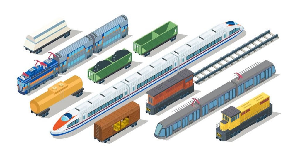
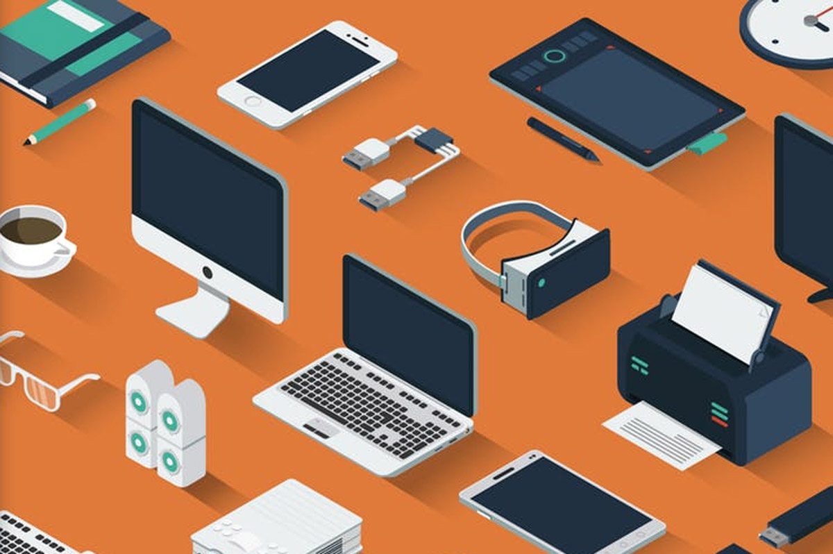
Dizanji isometrik është një metodë e vizatimit/krijimit të objektit tre dimensional në dy dimensional. Ikonat isometrike janë një zgjatje e kësaj teknike.

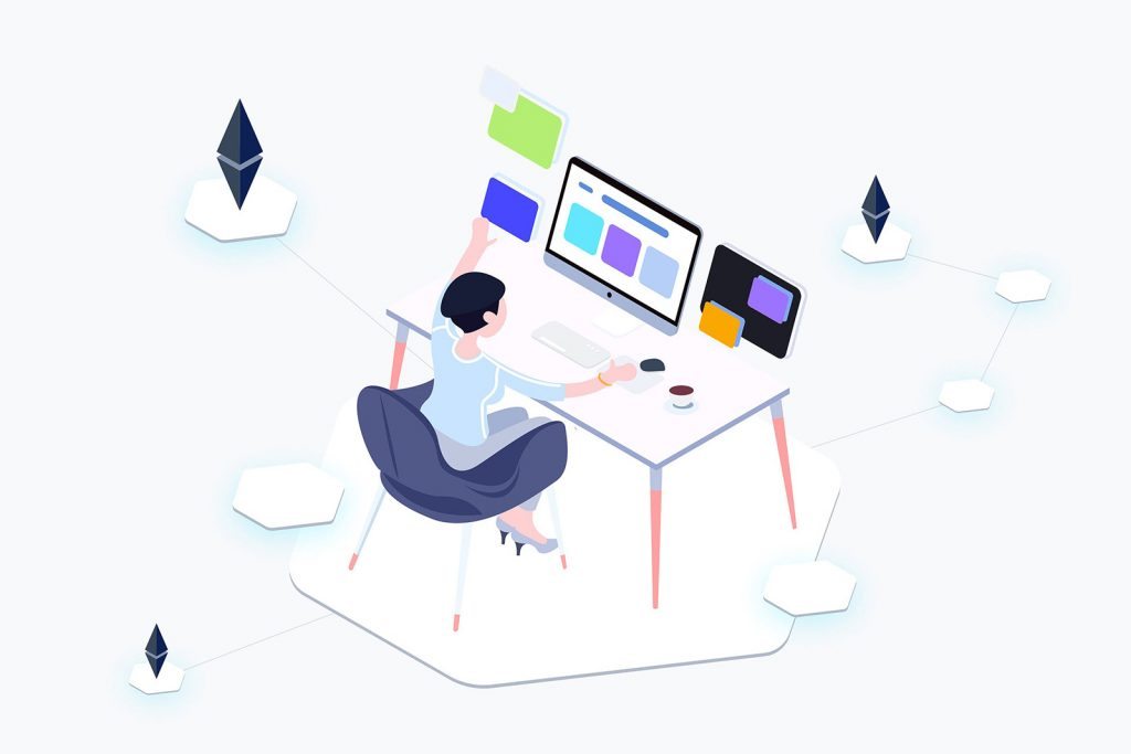
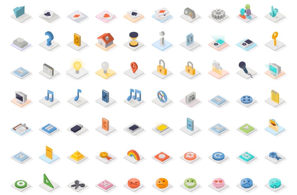
Janë një trend pasi kanë formë, thjeshtësi dhe thellësi. Ato theksojnë pamjen e bukur të flat design me një thellësi të shtuar dhe dimension i cili bën cdo element më të dukshëm dhe më të lehtë për tu kuptuar.

Shumë dizenjues janë duke u pëpjekur të krijojnë ikona isometrike dhe sete me forma dhe elemente që duken reale. Përdorimi i hijeve nga një prespektivë ndryshe teksa krijohet cdo ikonë mund të ndihmojë në pamjen më të thellë të dizanjit.


Një evoluim i ikonave nga Flat

isometric icons

Ikonat isometrike janë një evolucion i trendit të flat design, flat 2.0 dhe design material. Dizanji 3D dhe 2D ende përdor linja të pastra dhe stilizime me pak më shumë thellësi.

Gjithashtu paletat e ngjyrave vijnë nga materiale flat.

Stili isometrik është një kombinim i thjeshtësisë dhe informacionit, me një dizanj i cili është i thjeshtë për tu kuptuar nga përdoruesit.

Si të përdorni ikonat isometrike

Shumë dizenjues kanë filluar të punojnë mbi krijimin e ikonave isometrike në një dizanj të plotë.

Ikonat isometrike mund të përdoren në  shumë mënyra dhe kanë gjithashtu dhe karakteristika të ndryshme.

Një nga benefitet e këtij stili është se si pasojë e natyrës së thjeshtë të grafikës isometrike – statike ose të animuar – file-et mund të ruhen në formate të vogla në mënyrë që faqja juaj e internetit të ngarkohet shpejtë.

Gjëra të cilat duhet të keni parasysh

isometric icons

Edhe pse janë në trend ikonat isometrike nuk janë të përshtatshme për cdo projekt.

Disa shprehen se stili i tyre i jep një pamje prej kartoni disa aplikacioneve. Disa të tjerë shqetësohen se skema e ngjyrave mund të shpërqëndrojë përdoruesin nga mesazhi.

Përdorimi i disa ikonave isometrike pa një plan mund të kthehet në një ngarkesë grafike.

Ndërtimi i një seti me ikona isometrike mund të jetë më konsumues sesa dizenjimi i ikonave flat. Ka një nivel të detajeve të lartë dhe duhet konsideruar cdo efeket tre dimensional.

No Comments

Sorry, the comment form is closed at this time.