AlbWeb - Ndertim Faqe Interneti - Zhvillim Website - Fushata Marketingu - Zhvillim Aplikacion - SEO - Social Marketing - Design & Brand Identity | Flat 2.0: Why Your Website Needs This Design Update
15575
post-template-default,single,single-post,postid-15575,single-format-standard,ajax_fade,page_not_loaded,,qode-theme-ver-13.2,qode-theme-bridge,wpb-js-composer js-comp-ver-5.4.5,vc_responsive
 

Flat 2.0: Why Your Website Needs This Design Update

Flat 2.0: Why Your Website Needs This Design Update

Flat design is a style of graphic that uses minimalistic features in a two-dimensional manner. The inception of flat design stemmed from the hyper-realistic graphics of “web 2.0 design” from the early 2000’s. That design style started to feel cluttered from a user’s perspective, thus the pendulum swing toward flat design that followed. In order to make designs cleaner and enhance the visibility of key calls-to-action, designers gravitated toward the minimalistic flat design approach to remove as many distractions as possible.

After flat design (1.0) took off in the design world, we designers and UX researchers started to notice small issues with usability. For example, some users didn’t realize that buttons without shadows, textures or gradients were clickable, ironically making it harder to find the call-to-action. Another example of confusing flat design (1.0) is when designers would condense the main navigation links into the three-lined icon (commonly called a hamburger navigation).
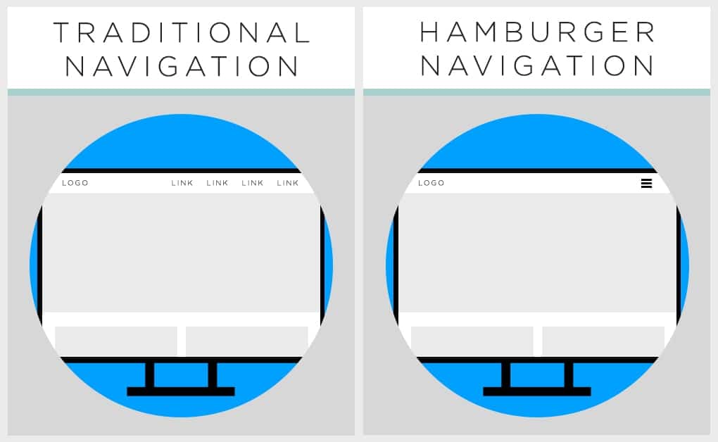
hamburger style menu

This gave websites a clean, minimal look since there wasn’t a lot of words at the top of each page; but, in some instances, users would miss the website’s entire navigation due to the easy to miss three lines. Users didn’t know they needed to click the hamburger menu icon to view the interior page links, which caused some obvious problems for time on page, pages per session and other website behavior metrics.

Flat design has all the key attributes that make a site as functional as it is beautiful. It brings us a step closer to a new paradigm of digital design, where the functionality and aesthetic are in complete harmony. – Nick Babich

Flat Design 2.0 Emerges

UX research eventually revealed that users needed a little more than flat design offered. Out of the usability hurdles of flat design 1.0, flat design 2.0 was born. This newer interpretation of design is sometimes referred to as “semi-flat,” “almost flat,” or “flat 2.0,” as Kate Meyer points out. While maintaining the simplicity of flat design 1.0, flat design 2.0 adds small details and visual cues back into the graphic (such as shadows, or slightly more descriptive text) to help more users convert by understanding they can take action.

Here are two examples that show the difference between flat design 1.0 and flat design 2.0:
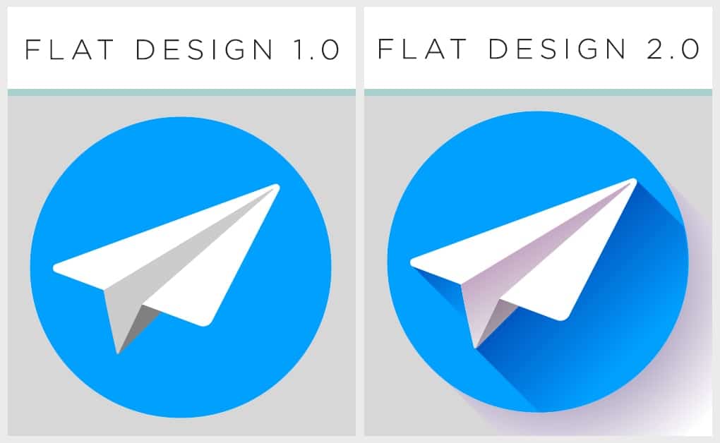
flat design versus flat design 2.0

As Carrie Cousins mentions, “Flat design 2.0 allows designers, in essence, to break the hard rules associated with flat design.” Cousins is referring to how flat design 2.0 now calls for:

  • Highlights
  • Gradients
  • Multiple tints and color values
  • Drop shadow
  • Any color palette (not just super bright like most flat 1.0 designs)

Similar to the original flat design, it’s recommended to remove all unnecessary styling or shapes, but then 2.0 adds one more of the features listed above to provide more depth and direction. Since the focus of flat design is on simplicity, the typography can start to be larger and more intricate because everything around it is minimal. This updated design style also encourages using an underline to indicate a hyperlink – otherwise known as “things that were completely off-limits in flat design 1.0.”
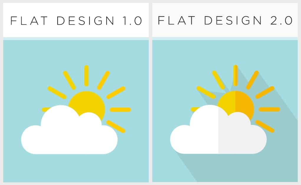
flat 1.0 versus flat 2.0


No Comments

Sorry, the comment form is closed at this time.


Flat 2.0: Why Your Website Needs This Design Update

Flat 2.0: Përse faqja juaj ka nevojë për këtë përditësim të dizanjit

Dizanji Flat ( i sheshtë ) është nje stil grafik i cili përdor karakteristika minimaliste dy dimensionale. Ky trend i dizenjimit pati fillesat e tij në “web 2.0 design” në vitin 2000. Ky stil dizenjimi filloi të pëlqehej dhe nga pikëpamja e përdoruesve, kështuqë dhe dizenjuesit filluan të përdorin këtë stil për të shmangur sa më shumë të ishte e mundur objektet e tepërta dhe për tu fokusuar më shumë në përmbajtje.

Pasi design (1.0) u eleminua, dizanjerat dhe kërkuesit UX filluan të shohin probleme të vogla me përdorueshmërinë. Përshembull, disa përdorues nuk arrinin të dallonin se butonat pa hije, pa tekst ose gradient ishin të klikueshëm, duke e bërë të vështirë kështu përdorimin. Gjithashtu një shembull tjetër ishte dhe konvertimi i menusë në 3 linja ( menu e quajtur hamburger ).

hamburger style menu

Ky lloj stili bënte të mundur që faqet e internetit të kishin një pamje minimale, por në disa raste përdoruesit e kishin të pamundur të kuptonin se në pjesën kryesore elementi me tre vija ishte pikërisht pjesa e menusë. Ata nuk e kuptonin se klikimi do të shfaqte me rradhë emrat e faqeve.

Dizanji Flat ka të gjitha atributet celës të cilat e bëjnë faqen e internetit funksionale dhe të bukur. Na sjell një hap më pranë një qasje të re të dizenjimit dixhital, ku funksionaliteti dhe estetika janë në harmoni totale. – Nick Babich

Flat Design 2.0

Kërkuesit UX janë shprehur se përdoruesëve ju nevojitet dicka më shumë se cfarë ofron ky stil. Ky interpretim i ri i dizanjit shpesh quhet si “gjysëm-flat”, “pothuajse flat” ose flat 2.0. Teksa ruhet thjeshtësia e flat design 1.0, flat design 2.0 shton disa detaje të vogla vizuale në grafikë ( si hije, ose tekst deskriptiv ) për të ndihmuar përdoruesit të kuptojnë veprimet që mund të kryhen në faqe.

Ketu janë dy shembuj të ndryshimeve midis flat design 1.0 dhe flat design 2.0:

flat design versus flat design 2.0

Flat Design 2.0 përfshin përdorimin e :

  • Ndricimit
  • Gradientëve ( hijeve )
  • Disa ngjyra dhe kode të ndryshme
  • Hije e lehtë
  • Cdo paletë ngjyrash

E ngjashme me flat design origjinal, është e rekomandueshme të eleminohen të gjitha format apo stilizimet e panevojshme, por 2.0 shton dhe një karakteristikë që është thellësia dhe drejtimi. Përderisa fokusi kryesorë i flat design është thjeshtësia, tipologjia e shkrimit mund të bëhet më e madhe pasi cdo gjë mes saj është e vogël dhe minimale. Ky përditësim në stil gjithashtu shoqërohet dhe me përdorimin e një vije për të shfaqur një hyperlink.

flat 1.0 versus flat 2.0


No Comments

Sorry, the comment form is closed at this time.